UX-design

Branding

Miljøbarn

Bringing Clarity to a Toy Rental Library Concept

Tools

Figma, Balsamiq, Wix

Timeline

Oct. 2025 - Dec. 2025

Team

3 UX-designers

Miljøbarn is a local toy library in Trondheim that allows families to borrow toys instead of buying new ones. This project explored how to make its concept clearer, more visible, and inviting, with my main focus on designing a website that helps families understand the service, become members, and borrow toys.

The Problem

Users found it difficult to understand what Miljøbarn offers, what their benefits are and finding practical information - such as joining activities, borrowing toys, or booking a visit.

The Solution

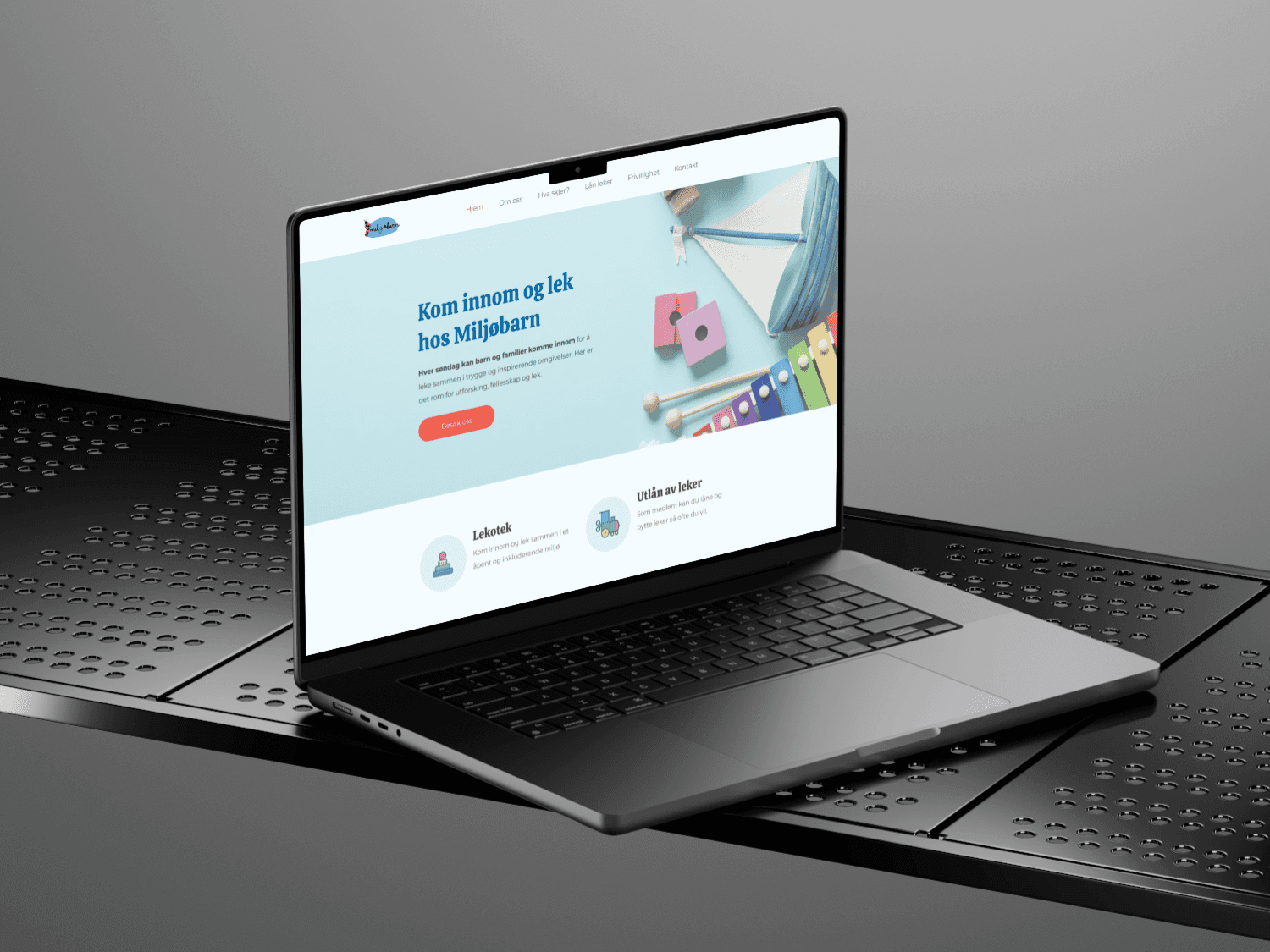
A clear and user-friendly website for Miljøbarn that made it easier for users to understand the service and navigate the available information.

Uncovering the Core Challenges

To understand the core challenges, we conducted interviews, surveys, and observations with the target group. The research revealed two key issues:

1) Low visibility - many potential users were unaware of the service.
2) Unclear concept - users struggled to understand what Miljøbarn offered and how it worked.

Getting to Know the Users

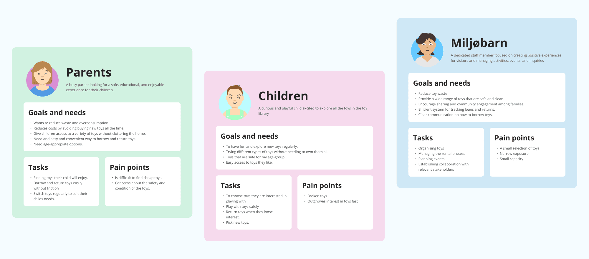
Based on the findings from the user research, we made three different personas: parents, children, and volunteers. This gave us a more clear understanding of each user groups needs, and how they approach the service with different goals, motivations and concerns.

Exploring Similar Concepts

To better understand industry standards, best practices, and gaps in existing solutions, we created a competitive analysis to compare similar services, including Whirli Kids, Jus Play, Liledu, and Cape Cod Toy Library. ​​​​​​​

Turning Insights into Solutions

To explore solutions to the core challenges, we developed an opportunity-solution tree to connect user insights with actionable design ideas. This led to several features in the final solution, including a step-by-step guide to borrowing toys, selling the membership benefits, and a social proof section to build trust.

Structuring the Experience

Before moving into development, I built a sitemap to structure the content into a clear hierarchy and logical flow. This helped ensuring that the users can quickly understand the structure of the information and navigate it intuitively.

Building the Foundation

In the next step I created a range of wireframes to explore structure, navigation, and hierarchy for the website. This phase allowed for an early validation of design decisions before moving on the final steps.

Defining the Visual Direction

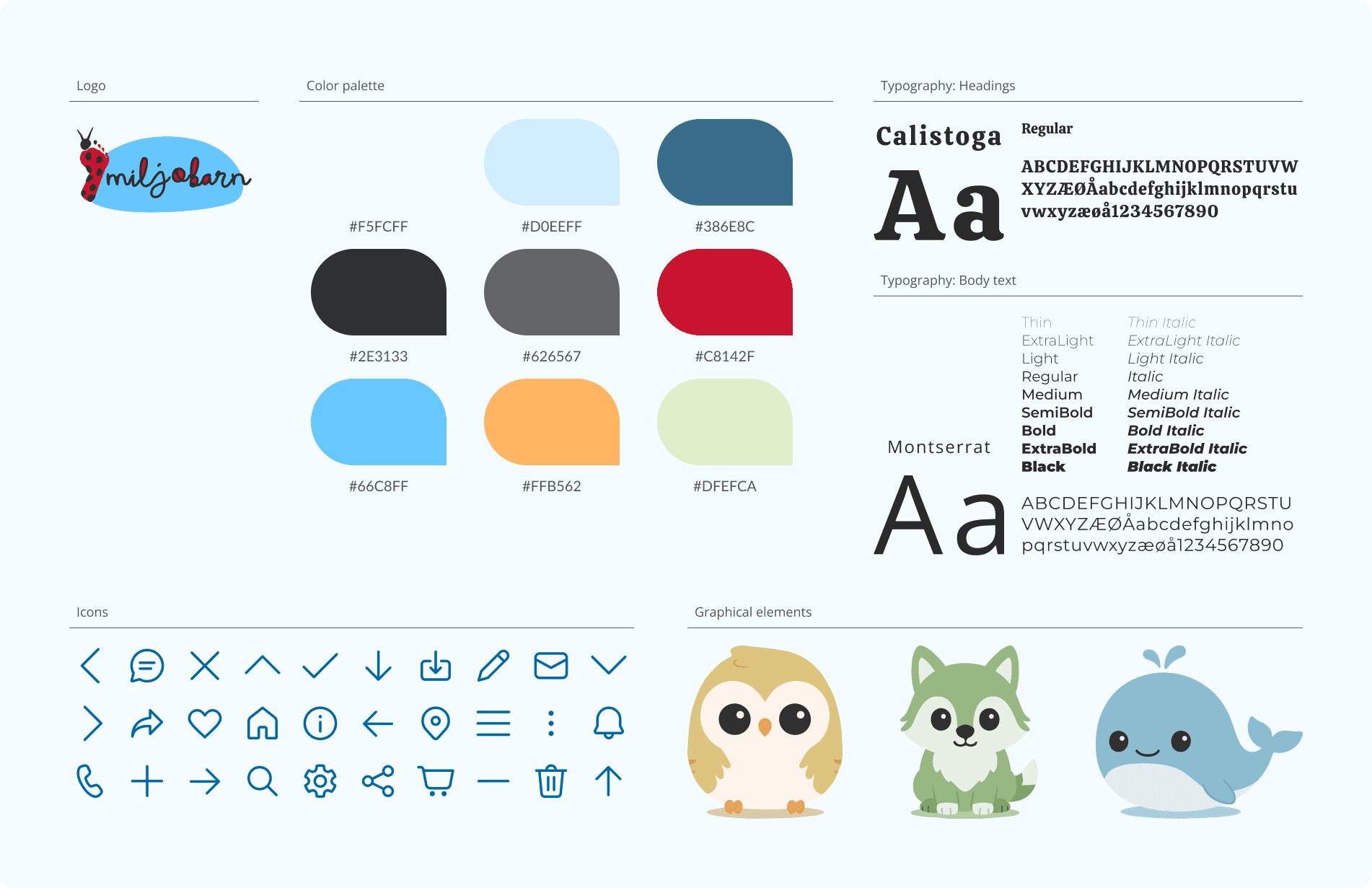
We aimed to present Miljøbarn's brand as approachable, friendly and playful. To support this, we used soft shapes, a playful color palette, and a warm, inviting tone of voice throughout the design.

Uncovering the Core Challenges

To understand the core challenges, we conducted interviews, surveys, and observations with the target group. The research revealed two key issues:

1) Low visibility - many potential users were unaware of the service.
2) Unclear concept - users struggled to understand what Miljøbarn offered and how it worked.

Getting to Know the Users

Based on the findings from the user research, we made three different personas: parents, children, and volunteers. This gave us a more clear understanding of each user groups needs, and how they approach the service with different goals, motivations and concerns.

Exploring Similar Concepts

To better understand industry standards, best practices, and gaps in existing solutions, we created a competitive analysis to compare similar services, including Whirli Kids, Jus Play, Liledu, and Cape Cod Toy Library. ​​​​​​​

Turning Insights into Solutions

To explore solutions to the core challenges, we developed an opportunity-solution tree to connect user insights with actionable design ideas. This led to several features in the final solution, including a step-by-step guide to borrowing toys, selling the membership benefits, and a social proof section to build trust.

Structuring the Experience

Before moving into development, I built a sitemap to structure the content into a clear hierarchy and logical flow. This helped ensuring that the users can quickly understand the structure of the information and navigate it intuitively.

Building the Foundation

In the next step I created a range of wireframes to explore structure, navigation, and hierarchy for the website. This phase allowed for an early validation of design decisions before moving on the final steps.

Defining the Visual Direction

We aimed to present Miljøbarn's brand as approachable, friendly and playful. To support this, we used soft shapes, a playful color palette, and a warm, inviting tone of voice throughout the design.

Uncovering the Core Challenges

To understand the core challenges, we conducted interviews, surveys, and observations with the target group. The research revealed two key issues:

1) Low visibility - many potential users were unaware of the service.
2) Unclear concept - users struggled to understand what Miljøbarn offered and how it worked.

Getting to Know the Users

Based on the findings from the user research, we made three different personas: parents, children, and volunteers. This gave us a more clear understanding of each user groups needs, and how they approach the service with different goals, motivations and concerns.

Exploring Similar Concepts

To better understand industry standards, best practices, and gaps in existing solutions, we created a competitive analysis to compare similar services, including Whirli Kids, Jus Play, Liledu, and Cape Cod Toy Library. ​​​​​​​

Turning Insights into Solutions

To explore solutions to the core challenges, we developed an opportunity-solution tree to connect user insights with actionable design ideas. This led to several features in the final solution, including a step-by-step guide to borrowing toys, selling the membership benefits, and a social proof section to build trust.

Structuring the Experience

Before moving into development, I built a sitemap to structure the content into a clear hierarchy and logical flow. This helped ensuring that the users can quickly understand the structure of the information and navigate it intuitively.

Building the Foundation

In the next step I created a range of wireframes to explore structure, navigation, and hierarchy for the website. This phase allowed for an early validation of design decisions before moving on the final steps.

Defining the Visual Direction

We aimed to present Miljøbarn's brand as approachable, friendly and playful. To support this, we used soft shapes, a playful color palette, and a warm, inviting tone of voice throughout the design.

What I've Learned

Visibility is just as important as having a strong concept, as users cannot engage with a service they are unaware of.

Clear communication is especially important when designing for an unfamiliar concept like a toy library.

Efficient communication is especially important when designing for users with busy everyday lives, such as parents with limited time and attention.

Creating thoughtful digital experiences with clarity, structure, and meaning.

Creating thoughtful digital experiences with clarity, structure, and meaning.

Creating thoughtful digital experiences with clarity, structure, and meaning.

Create a free website with Framer, the website builder loved by startups, designers and agencies.